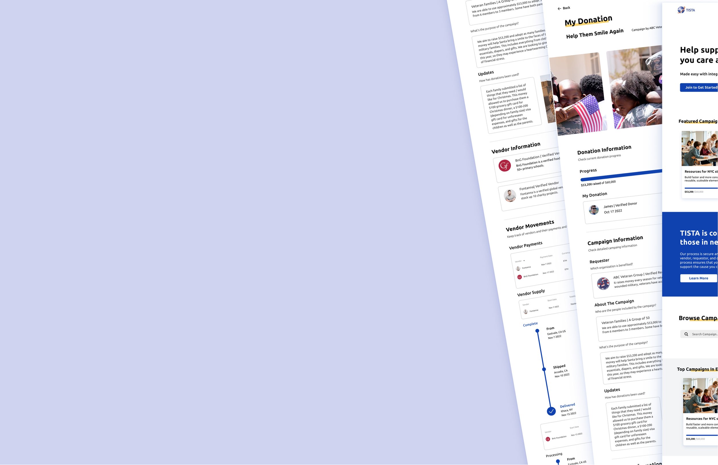
TISTA’s Crypto Fundraising Platform
The platform makes cryptocurrency donations easy for underserved communities. I improved the overall user experience by maximizing the distinct benefits of crypto transaction over traditional methods, thus boosting appeal for fundraisers and donors.
Timeline
Sep 2022 - Dec 2022 (12 Weeks)
My Role
User Research, UIUX Design, Usability Testing
Team
1 Product Manager, 3 UIUX Researchers & Designers, 3 Software Engineers
Tools
Figma, Node.js, MobX, Firebase, MetaMask
Introduction
Current Situation
Building upon an existing design solution
It’s a blockchain-based platform that enables basic end-to-end financial transactions and validations, to help underprivileged community people raise funds and get donations with cryptocurrency.
Initial Problem Scope
How might we enhance the platform to maximize its potential and overall user experience?
Initially, we were struggling to discover the existing user pain points and define our goals of improvement, because:
Lacking clear expectation from the clients
Lacking real user data & feedback - the platform was in pre-launch stage
Failed to gain access to target users - underprivileged community people (e.g. veterans)
Three User Groups
Research
Focus Group Sessions
We conducted a series of focus group sessions with participants who worked closely with the primary user groups. They were community leaders, TISTA project managers, contract workers, and volunteers. They had different levels of understanding about crypto platforms.
Core User Frustration
—— “Why cryptocurrency?”
—— “Why would the platform be attractive to people who are used to simply writing a check or using wire transferring?”
Updated Problem Statements
How might we maximize the crypto potentials so that the platform can be seen as better and easier than conventional options?
How might we help users to perceive and interact with the new technology in a user-friendly manner?
Market Research
Why is it critical to introduce cryptography in a fundraising platform?
A blockchain-based platform provides anonymity, allowing donors to contribute without disclosing personal information. The public nature of the blockchain ledger ensures transparency, enabling faster and more cost-effective transactions by reducing the need for intermediaries, ultimately making the flow of money more visible and efficient compared to conventional currency systems.
User Research
Ideation
Features Prioritization
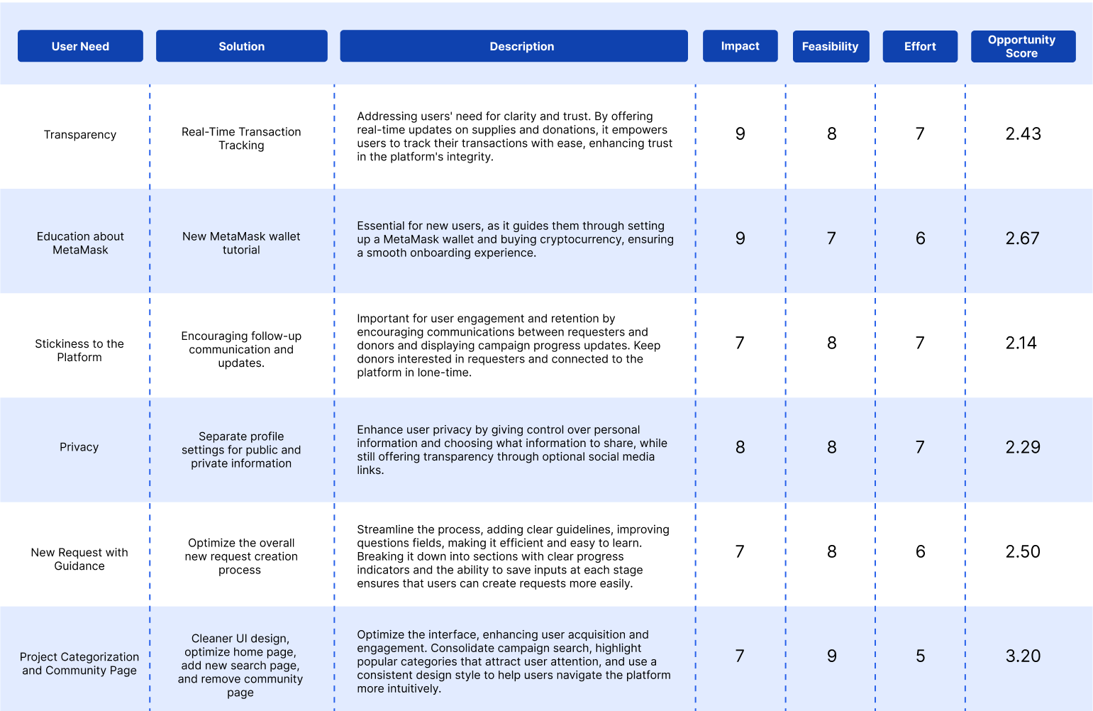
To address the key user pain points, we went through the process of ideating and prioritizing features. Focusing on the top 6 of most pressing issues categorized as Priority 0 and Priority 1, we recognized the unique challenges and opportunities each pain point brought.
User Flow
Feature A
Transparency
Question 1
How might we maximize the crypto potentials so that the platform can be seen as better and easier than conventional options?
Solution
✅ Stronger transparency in transactions.
Building trust and credibility, crucial for user acquisition.
Giving a key advantage over traditional methods.
Feature Ideation 1
Transaction Transparency Rating System
Allowing users rate transaction transparency, and the platform calculates and displays an overall score for each campaign.
— Why Rejected? ❌
Subjectivity in user ratings leads to unreliable scores.
Potential for rating manipulation undermines integrity.
High complexity and resource demands make implementation impractical.
Feature Ideation 2
Blockchain Verification Tool
Allowing users to verify transactions with a unique code matched against the blockchain for authenticity.
— Why Rejected? ❌
Technical complexity could discourage new users.
Extra verification step may decrease user engagement.
High resource demand for development and maintenance.
Feature Ideation 3
Enhanced Real-Time Transaction Details
Design the transaction page to show vendor, requester details, and real-time tracking in one location for instant transparency.
— Why Accepted? ✅
Technically feasible, integrating real-time data into profiles without complexity, ensuring user accessibility.
Meets user demands for clear insight into transactions, building trust and enhancing satisfaction.
Usability Testing
Usability Issues
Navigation Challenges: Quick access to specific details was hard through extensive scrolling, proving time-consuming.
Information Density: A long scroll format without clear breaks caused information overload, overwhelming participants and impeding efficient processing.
With the usability issues of the continuous scroll layout being discovered, I developed two alternative designs to enhance navigation and manage information density more effectively.
Iteration
Version A
Side Menu Navigation Layout
The menu, located on the side, organizes content into clear sections.
Allowing users to jump to different sections of the transaction details page directly.
Addressing the issue of long scrolling and providing quick access to various information categories.
Version B
Horizontal Menu Navigation Layout
Placing the navigation menu horizontally across the page
Allowing users to select between sections with ease.
Providing a clear navigation while also keeping the information visible and minimizing the cognitive load.
A/B Testing
I then conducted an A/B testing to assess the two iterations. Group A interacted with the side menu navigation layout, while Group B was tasked with using the horizontal menu navigation layout
Final Design Solution
My Donation - My Donation
Donation information
Current overall progress
User’s donation
My Donation - Campaign
Detailed campaign information
Organization
People involved
Reason of request
Where donation will be used for
My Donation - Requester
Requester’s updated stories
Keep donors interested in requester for a longer period of time.
Enhance user stickiness of the platform
My Donation - Vendor
Detailed Vendor information
Vendor Identity
Payments (currency, amount, status, etc)
Supply movements (supply type, amount, start date, progress, etc)
My Donation - Transaction
Real-time Transaction
Tracking the whole process of supply delivery
Updated status & location
Updated image
Feature B
New Request Creation
Question 2
How might we help users to perceive and interact with the new technology in a user-friendly manner?
Usability Challenges
Usability Challenges discovered in the Previous New Request Creation Design:
❌ Navigation and Accessibility: Submission guidelines on the side required frequent attention shifts, disrupting the input process.
❌ Flexibility Limitations:
Not supporting selecting multiple vendors, hindering support for complex campaign needs.
❌ Limited Media Upload:
A single image upload option restricted the depth of campaign storytelling and authenticity.
❌ Data Integrity and Compliance:
Absence of validation for vendor information risked non-compliance and data inaccuracies.
Improvements Needed
✅ Enhanced Media Support
✅ Vendor Validation
✅ Multiple Vendor Choices
✅ Segmented Submission Process
✅ Progress Bar Visibility
✅ Save Progress Feature
Mid-fi Prototype
Usability Testing
Usability Issues
Vague Campaign Inputs: Participants provided insufficient campaign information due to the overly general question, showing a need for more specific prompts.
Understanding Vendor Role: Participants struggled to understand the purpose and function of vendors, indicating a need for clearer instructions.
Final Design Solution
New Request - Campaign Information
Segmented Submission Process:
Divides the request process into 3 distinct sections for clearer navigation.
Progress Bar Visibility:
Incorporates a progress bar to inform users of their current status.
Enhanced Question Clarity:
Introduces specific, detailed questions to gather comprehensive campaign information, including objectives, organization background, and donation usage.
Contextual Guidelines Integration:
Distributes submission guidelines contextually alongside related input fields, minimizing distraction and streamlining the input process.
Save Progress Feature:
Enables saving after completing each section, minimizing cognitive load and preventing errors.
New Request - Vendor Information
Clarified Vendor Role: Provides clear, concise explanations of vendors' purpose and function, directly within the relevant sections, to enhance understanding.
Vendor Validation: Ensures all selectable vendors are pre-approved by platform.
Multiple Vendor Choices: Enables the selection of various vendors.
Reflection
Direction for Improvement: Without specific client directives, defining the project's scope was difficult. Leveraging insights from interview sessions, we explored new design approaches beyond the platform's basic functionalities, focusing on innovation and user needs.
Limited Access to Target Users: Accessing primary user groups, particularly underprivileged communities, directly was challenging, risking the authenticity of our insights. Collaborating with community leaders for indirect insights stressed the importance of flexible research methods, ensuring our designs align with real user needs despite indirect engagement.
Challenges
Enhancing Requester Visibility: Focus on developing features to make each requester stand out, such as unique profiling and campaign highlighting options, to address the competition for attention and funds.
Multi-Perspective Design Approach: Expand designs to reflect the unique needs and perspectives of all user groups (donors, requesters, vendors), ensuring a tailored experience that varies by user role for enhanced intuitiveness and efficiency.
Optimizing for Mobile and Responsive Design: Improve platform responsiveness and mobile accessibility, ensuring seamless user experience across various devices and screen sizes by refining UI elements for adaptability.


