Overview
Helping Therapists Manage Workshops with Confidence: A Feature Onboarding System
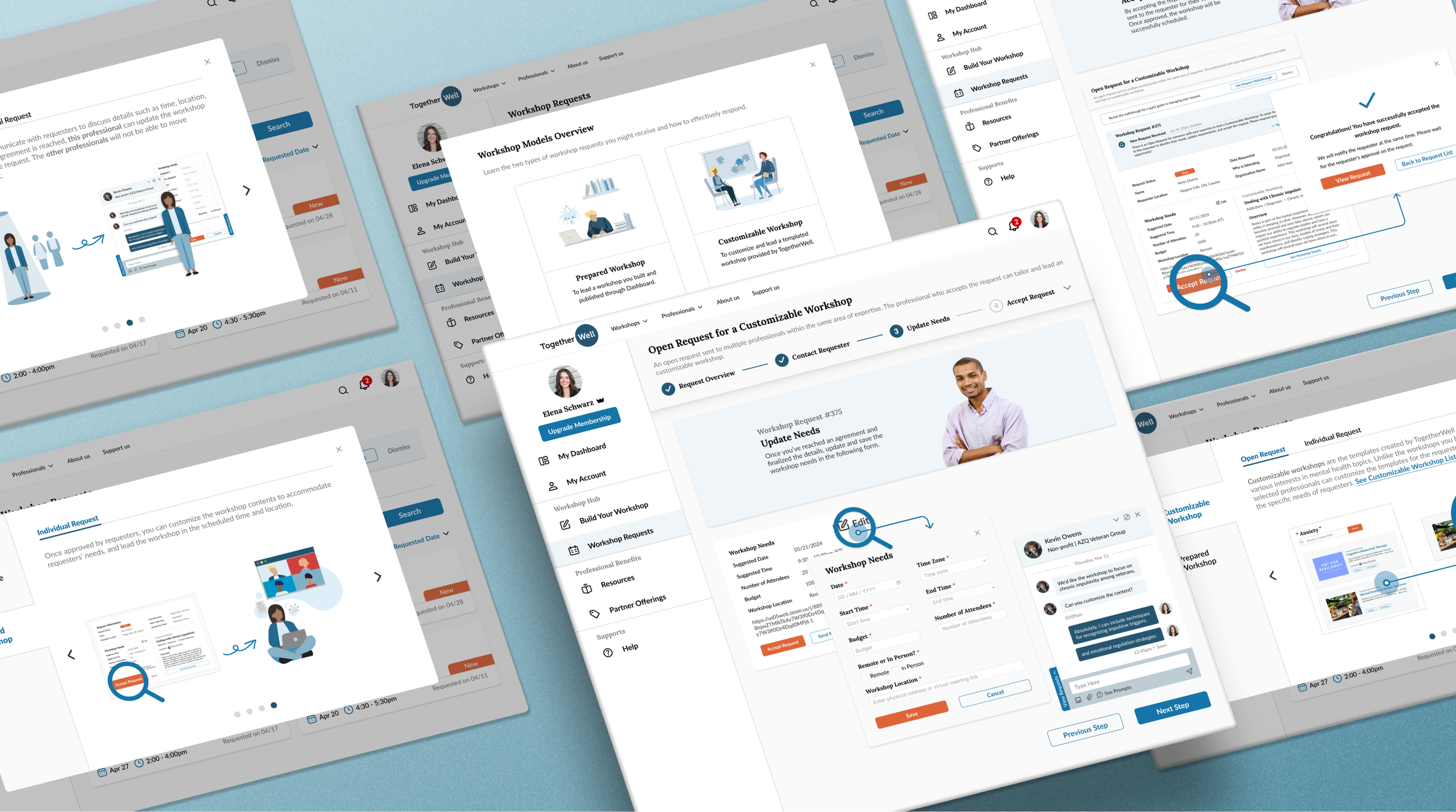
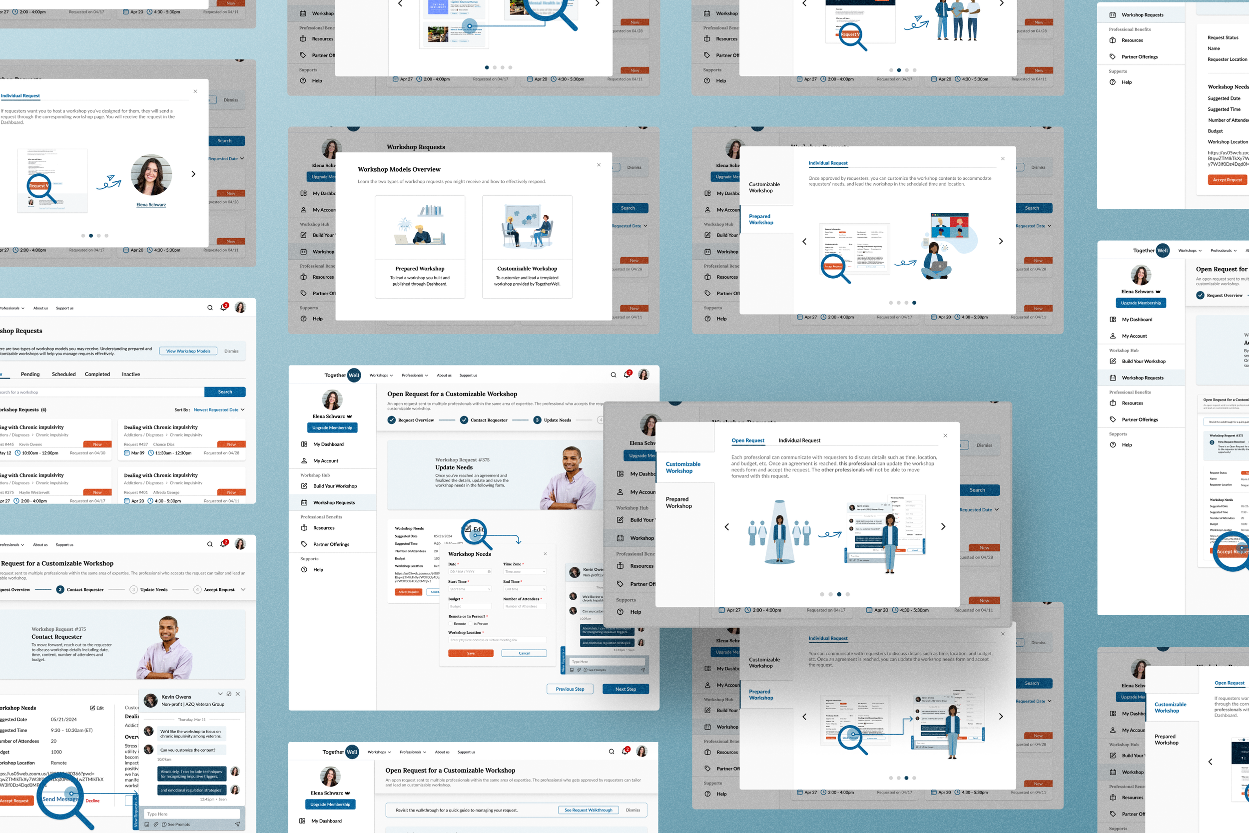
TogetherWell’s workshop management platform introduced an enhanced end-to-end system and new workshop model designed to meet platform goals. To reduce the learning curve and ensure user success, I designed the guidance system for workshop management, which features the Workshop Models Overview and Workshop Management Walkthrough. These solutions simplify concepts and provide step-by-step guidance, helping therapists manage workshops with confidence.
Timeline
5 weeks (Sep - Oct 2024)
My Role
Product Designer
Team
Founder, UX Designer (peer feedback), Graphic Designer, Content Writers
Tools
Figma, FigJam, Slack, Freedcamp
My Tasks
User Interview, Concept Strategy, Cross-Functional Leadership, UX Writing, Graphic Design, Usability Testing, Hi-fi Prototype

Background
Problems
How might we help therapists understand and adopt the new workshop management system and innovative workshop model, ensuring they can manage workshops confidently?
Testing Results
Improved task completion, understanding, and satisfaction
73% testing users reported higher task completion rate with the Workshop Management Walkthrough.
85% testing users reported better understanding of workshop models and request types after viewing the Workshop Models Overview.
90% testing users reported higher satisfaction with the guidance system, with reduced confusion in managing workshop requests.
Current Platform Challenges
1. Understand and navigate enhanced workshop management workflow
The enhanced system allows therapists and requesters to customize workshops on-platform, but without guidance, therapists may lack confidence to navigate the workflow as intended. The challenge is to simplify learning and ensure proper use without adding complexity.
2. Customizable vs. Prepared: understand and adopt new workshop model
The platform added Customizable Templated Workshops alongside existing Prepared Workshops to broaden topic coverage, but lacked guidance for effective adoption. The challenge is to clarify the concepts and required actions without overwhelming users.
Research
User Interview Insights
Pain points: unclear request types, missed steps, workshop models confusion
Initially, I interviewed 8 users to understand current workshop management experiences. While redesigning the system, I tested the new workflow with 6 users to identify areas needing guidance for easier adoption.
Phase 1
Ensuring informative and easy-to-follow guidance for effective workshop management
Problem 1
How to help therapists adopt the new workshop management system and follow the correct workflow steps to ensure success?
Design Decision 1
Design a Workshop Management Walkthrough
Approach 1: fixed linear workflow - ensuring users follow ideal path each time
Fixed flow: 1. communicate with requester —> 2. Update requirements form —> 3. Accept request
“Accept Request” button is only accessible after completing all required steps to avoid skipping steps
Why Rejected - Inflexibility and added complexity
Inflexible: Real-life scenarios often needs multiple updates, the linear process forces users to restart and go back and forth, causing extra user efforts.
Complexity: The long process with a minimum of 7 clicks would lower efficiency and user motivation.
Approach 2: product tour for first-time users - detailed explanations before workflow
Only guide first-time users with more detailed explanations, avoiding the repetitive complexity of fixed flow.
Why Rejected - Complexity and high development effort
Complexity: The detailed tour feels long and overcomplicates the workflow, leading users to skip it.
More Building Effort: Requires more detailed scripts and development efforts to implement effectively.
Final Approach: quick introductory walkthrough - key instructions before workflow
Offers essential guidance and flexible navigation for managing requests
Balanced Info: Helps users understand the correct steps to manage requests while keeping it simple.
Flexible: Appears initially, then transitions into simplified request page, allowing free navigation for tasks like checking info, messaging, or updating requirements as needed.
Problem 2
How to help therapists identify the workshop models and request types they receive, and respond accordingly?
Design Decision 2
Tailor walkthrough scripts for each workshop model and request type. Explain their unique meanings and required actions.
Walkthrough Script Writing Strategy
Goal: Encourage therapists to respond promptly and appropriately.
Collaboration with Content Writers - for each workshop model & request type
I created the script strategy and worked closely with content writers to ensure walkthrough messaging met requirements and user needs.
Problem 3
How to visually convey each step of the workflow and guide users on how to act?
Design Decision 3
Use annotated screenshots to highlight key Interactions on interface
Approach 1: video tutorial
Uses videos for each step to guide users through the workflow with voiceover to add clarity.
Concerns - slow and disruptive
Need to hit “play” to start, might disrupt flow.
Include adds, adding unnecessary steps
can be time-consuming for a quick walkthrough
Approach 2: GIF screen recording
GIF screen recording offers a quick visual demonstration without overcomplicating the process
Concern - key actions might be overlooked
Without voiceover, key actions might not stand out within entire process, making it harder for users to notice and memorize them.
Final Version - Annotated Screenshots for Key Actions
Highlights the most critical actions users need to keep in mind.
Straightforward and quick to process, avoiding unnecessary complexity.
Collapsible Progress bar - adding steps explanations while saving space
Option to revisit walkthrough
Phase 2
Ensuring clear understanding of workshop models and request types
Problem 1
How to help therapists easily understand and differentiate concepts of workshop models and request types?
Design Decision 1
Design a centralized overview to clarify and compare the concepts
3 possible scenarios users might encounter
Initial Concepts - 3 Scenarios
Side-by-side comparison of the 3 scenarios, explaning:
Workshop models (Customizable or Prepared)
Request types (Open or Individual)
Required user actions
Initial Overview Design - more detailed explanations of 3 scenarios
Graphics & screenshots simplify concepts
Uses detailed explanations paired with screenshots & graphics to visually represent concepts
Making concepts more intuitive for users to process.
Tested initial version - found users confused by open request concept
Testing users struggled to process the concept “For open requests, only 1 therapist can be selected to host the workshop” with current graphics.
Final version - improved graphics to explain concepts
I collaborated with a graphic designer to refine graphics, making concepts easier to understand.
Problem 2
How to simplify 3 scenarios concepts to make them clearer & reduce learning curve?
Design Decision 2
Refine the concepts and redesign how they are presented to users.
Tested initial concepts - found users confused by 3 scenarios
Complex concepts impacted user adoption
68% testing users found the 3 scenarios concepts not intuitive, reducing their willingness to learn and use the platform.
Solution 1: Combine Scenarios A & B
44% testing user without experience on therapy session platforms prefer combining the 2 scenarios for easier understanding.
Simplifies concepts but sacrifices transparency, risking future user satisfaction
Users lose transparency about whether a request is sent to group or individual.
Lead to long-term frustration when users notice differences, such as expecting too much from an open request but not being selected
Solution 2: Be transparent & keep 3 scenarios separate
56% testing user with experience on similar platforms prefer maintaining transparency.
Transparency helps users respond appropriately, but may overwhelm new users
Open requests: respond quickly to secure the opportunity
Individual requests: feel empowered to negotiate and invest more efforts
Con: overwhelm new users and lower adoption rates
Final Decision: refine concepts & representation
Separate workshop models (Prepared vs. Customizable) and request types (Open vs. Individual) for clarity
Customizable workshop model: can be sent as open or individual request
Prepared workshop model: can only be sent as individual request (assigned to the creator)
Pro: Maintains transparency while making concepts digestible, and easy to process.
Reflection
Overcoming Challenges throughout the Project
Designing clear guidance with a beginner’s mindset
The challenge was stepping out of my familiarity with the system to design for users with no prior experience. Creating clear and digestible guidance was essential. It needs to meet platform requirements, help users understand system, and avoid overwhelming them. I achieved this balance through testing and iteration.
Leading cross-functional efforts to align strategy, content, and design
Taking the lead on project required me to go beyond UX design to shape product and concept strategy, guide cross-functional collaboration, and make key decisions on content writing and graphic design. By focusing on team communication and alignment, I ensured every detail served platform’s goals and user needs.


